The Xbox dashboard, a visual history – The Verge
Few interfaces have changed more often — or more radically — than the Xbox dashboard. Most platforms with a large user base are incredibly slow to introduce sweeping changes, but that hasn’t been the case for Microsoft’s game consoles. History shows that its strategy for working in new features and services involved scrapping its previous interface, essentially asking you to re-learn how to use the machine and find your content.
Microsoft deserves credit for experimenting with its dashboard throughout the years, even if many of those experiments weren’t great. With the Xbox Series X set to release later in 2020, now seems like a good time to catch up on the history of the Xbox One and the Xbox 360 dashboard to see where it’s been and where it may be going.
:no_upscale()/cdn.vox-cdn.com/uploads/chorus_asset/file/19749288/11_15_12Blades_Web.jpg)
Some updates were better (or worse) than others, but they all have something in common: they’ve all been succeeded by a new vision. As this visual history points out, some of their ideas are seen in modern iterations of the dashboard and will be in updates to come and perhaps on future consoles, too.
Xbox 360
Blades (2005)
Good: Fast and tidy
Bad: It looked like a Winamp skin
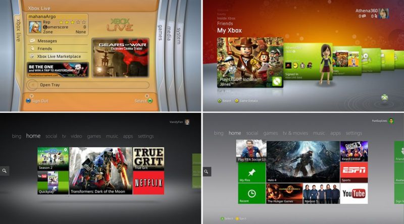
The “blades” dashboard interface debuted on the Xbox 360 at launch, organizing each of the console’s main features into separate sections. This interface had a lot more to squeeze in than the comparatively sparse-yet-stylish dashboard found on the original Xbox. Even so, it was tidy and easy to understand. Also, quickly switching between sections was responsive, and elements were fast to load (even with the 360’s 512MB of RAM). And that “whoosh” sound effect from switching blades will forever be lodged in my brain.
You could argue that this was as close as Microsoft got to perfecting the dashboard, though you could also argue that it wouldn’t have scaled well with future ambitions). That said, inspiration from this dashboard can be found on following updates if you look hard enough.
:no_upscale()/cdn.vox-cdn.com/uploads/chorus_asset/file/19748215/18rj29sdt6tvjjpg.jpg)
New Xbox Experience (2008)
Good: Avatars! More customizable than blades
Bad: Not as fast or satisfying to use as blades
Three years after the launch of the Xbox 360, Microsoft wiped the slate clean with the NXE interface update. And with the advent of Netflix instant streaming and other entertainment-based apps, the Xbox 360 was beginning its descent into interface madness, having to juggle gaming with other forms of entertainment on the dashboard. It started to look like a set-top box.
Remnants of the beloved blades could be found when you pressed the Xbox button on the controller. But on the dashboard, they were replaced in favor of each section being stacked on top of each other. Navigate to the one you want, then all of your content lived within its tile-based interface that you could scroll through from left to right. It looked more polished and mature than blades, but it wasn’t necessarily faster or easier to use. Some may have liked it, but not everyone did.
Under the hood, it brought about some important updates for the Xbox 360, like avatars to compete with Nintendo’s Miis. It also introduced the ability to stream HD videos on Netflix, form parties on Xbox Live, and install games onto the hard drive for faster loading.
Kinect update (2010)
Good: More refined version of NXE
Bad: More convoluted, too, and Kinect support was shoe-horned
Avatars were just one part of Microsoft’s plan to copy the successful Wii. It wanted gamers to use the Kinect camera to get moving, and thus, the design of this new dashboard update made Kinect the centerpiece.
Really, this was a minor visual update to the NXE. It still had the same overall look, structure, and navigation that the 2008 update introduced, but Microsoft worked in the ability to move around the dashboard with the Kinect (RIP). If you didn’t like the NXE, you probably didn’t like this, either.
:no_upscale()/cdn.vox-cdn.com/assets/746724/newxboxtvexperience.jpg)
Metro (2011)
Good: Nice to look at, brought back blade-style main navigation in a sense
Bad: Simplistic interface didn’t aid in quickly sorting through troves of content
The 2011 update that introduced the “Metro” design showed that Microsoft was trying to juggle more than ever, but it chose a new dashboard look that didn’t afford enough space to comfortably express it. The design language gave off a sense of “less is more,” but what it really proved was that less was less. Microsoft is still trying to shake away some ideas from the Xbox One’s dashboard that came with this update.
Each screen only housed a few tiles, and to find other content, you’d have to drill down into disparate folders. And in its sixth year on the market, some of these features were beginning to show the Xbox 360’s age.
In a sense, this dashboard update merged blades with the NXE, letting you use the bumpers to shift between categories a la blades and navigate each of the colorful tiles within each section like you could in NXE. And of course, it was compatible with Microsoft’s Kinect, so if you had the camera, you could swipe between menus by waving your hand or using your voice to search on Bing.
Under the hood, the update brought some important features, like cloud storage for game saves. We tracked its every development back in 2011 before it launched.
Xbox One
:no_upscale()/cdn.vox-cdn.com/assets/3596849/VRV_038_XboxOne_v3.Still002-1024.jpg)
The launch dashboard (2013)
Good: Highly customizable
Bad: Crowded and confusing to navigate, quite laggy, lopsided focus in favor of TV
The Xbox One launched on the heels of Windows 8, so it’s no surprise that the desktop OS’s “Metro” design was used as the bedrock of its launch dashboard in 2013. Unlike the Xbox 360 dashboards, shown above, that use a similar styling, this one was a certified mess to navigate because it mixed games with TV and everything else on the home screen. Discovery of new content was prioritized over discovery of content you already have.
Microsoft’s first stab at the Xbox One dashboard was ambitious in all of the wrong ways, though it has since walked back most of its major missteps. For instance, Microsoft didn’t see the cord-cutting revolution coming, so its big on-demand TV and DVR gamble fizzled out. Plus, the conceptually great “snap” function that Microsoft believed in so thoroughly that it put a button for it on the controller was abandoned in 2017. (It’s getting rid of the button altogether on its new Xbox controller coming in 2020.)
Good: Far easier to navigate than the launch dashboard
Bad: Faster but still not snappy
The first big overhaul to the Xbox One dashboard put a much-needed focus on your games. It also promised to be faster, and it was, but it wasn’t nearly fast enough. Microsoft had just launched Windows 10, and as it did on PC, it was making a big push for its voice assistant Cortana on console. The iterations of the dashboard that follow all riff on the general design introduced here, which is to say that Microsoft was on the right track with this update.
Good: Further emphasis on pins to sort content
Bad: Too much content still lived just out of view
Microsoft’s next update injected Fluent Design, the look and feel that Microsoft employed on Windows 10. The new home screen focused on showing your recent activity and giving gamers faster access to community features.
It also made better use of pins, which allow you to break apps and games into sections. Instead of having to scroll through tiles and menus to find where your content is, being able to vertically scroll through a few pins was far easier, though still not perfect. Game Pass debuted in 2017 before this dashboard update released, but while the service was catching on, it remained a little too far out of view.
:no_upscale()/cdn.vox-cdn.com/uploads/chorus_asset/file/19744819/Xbox_One_Simple_Home_UI.jpg)
The refinement process (2018–present)
Good: It’s getting better with each update, and (finally) it’s less laggy.
Bad: Everything is changing more frequently than ever
Cortana voice interaction is gone. FastStart lets you boot into games before they finish downloading. Xbox Game Pass has its own section on the main navigation. The eject button, it’s coming! Microsoft has been iterating on the Xbox One dashboard faster than ever, and in the interest of speeding things up, clearing the cruft of earlier dashboards, and making it easier to access games.
As for the latest update that released in late February 2020, my colleague Tom Warren says it “focuses on overhauling the home page of the Xbox One dashboard, with frequently used games and apps available immediately. The new Home design also includes the ability to add or remove rows to customize it further, and quick access to Xbox Game Pass, Mixer, and the Microsoft Store.” You can read more about it here.
It’s never been more apparent that Microsoft is quickly trying to solve for its ongoing identity crisis with the dashboard. The Xbox One has seen big reworks of the dashboard more frequently than before, and the stakes are high as we get closer to the launch of the Xbox Series X in late 2020.
:no_upscale()/cdn.vox-cdn.com/uploads/chorus_asset/file/19526235/xboxseriesx.jpg)
Xbox Series X
Launch dashboard (2020)
Good: ?
Bad: ?
Microsoft will launch the Xbox Series X in late 2020, and it’s a toss-up as to whether it chooses to start from scratch with a new dashboard for its new console or if it will build off of the momentum from the latest Xbox One dashboard update, and what’s to come between now and launch day.
Given that Microsoft is touting backward compatibility with games from all previous generations of Xbox, it’s easy to imagine it choosing to load a slightly modified version of the Xbox One’s dashboard onto the Series X. We’ll have to wait and see what it chooses to do.


